Dragon Ball Super: Beerus Remake Fans Argue the Rough 2015 Hit-Reaction Face Was Better
ドラゴンボール超ビルス、2015年版の"あの顔"は実は名シーンだった?海外ならぬ日本のファンが論争

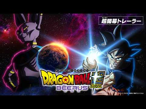
Dragon Ball Super: Beerus pulled up one of the most mocked frames in franchise history this week -- the moment Goku takes a full hit from Beerus and his face warps into an infamous, blurry scribble -- and set it side by side with the cleaned-up 2026 remake version of the same shot.
The clip comes from a Japanese reaction-compilation channel and drew 223 comments and 5,356 likes, with viewers split over whether the rougher, more distorted 2015 original actually sells the impact harder than the smoother redraw does, plus a color-inversion trick that complicates the whole "bad animation" narrative.
By the end, even the thread's most reasonable voices can't fully commit to one side.
A Japanese reaction-compilation channel pulled up one of the most mocked frames in Dragon Ball Super history this week: the moment Goku takes a full hit from Beerus and his face warps into an infamous, blurry scribble. That shot comes from the original 2015 Beerus Saga broadcast, which adapted the Battle of Gods movie into a TV arc, and it's been a running punchline among fans for over a decade for how rough the drawing gets. The channel set that old clip side by side with the same beat redrawn, frame for frame, for the 2026 Beerus remake, and the resulting 223-comment thread pulled in 5,356 likes -- not because anyone agreed on which version looks better, but because nobody could.
“Turns out a little bit of "bad" animation can actually have more character.”
多少崩壊してる方が味が出ることもあるんやな
That's basically the whole thread in miniature. A good chunk of commenters jumped in to defend the much-maligned 2015 original, arguing the messier, more distorted face actually sells the hit better than the smoother 2026 redraw does.
“At the very least, the moment he takes Beerus's hit genuinely sells the impact harder in the 2015 version.”
少なくともビルスの一撃くらうところは2015年のほうがガチ効きしてる感じある。
“Fair point, but the original Super took the "bad art equals more impact" thing way too far elsewhere.”
その理論も確かにあるけど、旧超は崩し過ぎた
Things got more technical once someone pointed out a trick buried in the original scene. Invert the colors on Goku's warped 2015 face, and the lines line up almost exactly with the clean art of the 2026 remake -- meaning the "ugly" scribble wasn't sloppy in-between animation at all, it was a deliberate color-negative effect the whole time, applied on top of the same underlying linework fans had been laughing at for years.
“With the colors inverted, the old one doesn't just stop looking bad -- it genuinely looks like it hits harder.”
上の方は色反転してると気にならないどころかガチで効いてる感じあって良い
“Whoa, invert the colors and it's literally the exact same coloring as the remake.”
すげぇ色反転したらマジでそのままの色や
“I mean, it's literally just the normal drawing with the colors inverted, so of course flipping it back a second time fixes it lol”
そのまんま描いたのを反転してるんやからもう一度反転したら直るのは普通じゃない?w
From there, a few commenters tried to explain why the older version still reads as more painful on a technical level, even with rougher line art, rather than just chalking the whole thing up to nostalgia.
“The older version even nails the sense of gravity pulling him down after the hit. With speed battles, a blurred-out face is actually the correct way to draw it -- clean it up too much and you lose the sense of speed.”
上の方が攻撃喰らった時の下に落とされる重力表現まで出来てる 結局スピードバトルは顔がぶれて見えるのが本来の作画の描き方だからまともに描こうとするとスピード感が薄れる
“The old one reads like he genuinely never saw it coming. The new one reads more like he expected it, but it still hurt way more than he thought it would.”
上は本当に意識の外から攻撃喰らったんだなって感じで味がある 下は予測は出来てたけど想像よりずっと上のダメージを受けたって感じ
Not everyone's convinced the nostalgia is earned, though, and one reply calls out what it sees as the whole thread's inconsistency -- spending years mocking the same animation it's now defending.
“People trashed the animation on this for years, and now that it's finally been remade, suddenly it's "actually the old one was better here" -- that flip-flop is kind of gross, not gonna lie.”
今まで散々作画で言われてたのにいざリメイクされたら「ここは昔の方が良いな」ってムーブがちできしょい
“It's funny that the official side got roasted for this so much that they're now clearly desperate to redeem themselves with the remake.”
イジられすぎて公式が名誉挽回・汚名返上に躍起になってんのがオモロい。
Even the thread's most measured reply, posted near the end, can't fully commit to one side of the argument -- it just narrows the defense down to this one shot specifically, rather than the Beerus Saga's animation as a whole.
“Just for this one color-inverted shot, I actually do like the 2015 version -- there's something about looking totally blindsided by the attack that sells it. Everywhere else the animation just straight-up falls apart, though, so it's not like I'm defending the whole thing.”
ここの色反転シーンに限れば2015年版も好きなんよねw 本当に反応出来なかった攻撃に虚をつかれた感じがあって。 他のシンプルに作画崩壊してる所は駄目だけど
Eleven years on, a scribble that spent over a decade as the series' go-to punchline still can't settle whether it was ever actually bad -- and the remake arguing against it may have only made the case stronger.
FAQ
- What's the infamous Goku face scene from Dragon Ball Super: Beerus?
- In the original 2015 broadcast of the Beerus Saga, the moment Goku takes a direct hit from Beerus was drawn with a warped, blurry face that became a long-running punchline among fans for its rough animation. The 2026 Beerus remake redrew the same beat with cleaner, more polished art.
- Why do some fans prefer the rough 2015 version over the clean 2026 remake?
- Commenters on a Japanese reaction channel argued the messier 2015 art better conveys the sense of a blindsided, overwhelming hit, and that a blurred face is actually the traditional way to draw speed and impact in a fight scene -- something the cleaner remake arguably loses. Others pointed out that inverting the colors on the 2015 frame lines it up almost exactly with the remake's art, suggesting the "ugly" original was a deliberate color effect rather than sloppy animation.
Dragon Ball Super: Beerus Episode 1: Fans Debate How Far the Remake Goes
“Personally, one of the best things about Dragon Ball Super: Beerus is that the sound effects — the punch impacts, the Super Saiyan transformation sound — are back to the old Dragon Ball Z ones! Honestly, those sound effects are recognized worldwide as "the sound of Dragon Ball Z," so I bet there are a ton of overseas fans happy about this too!”
Read this roundupThis is one of 4 Japanese-reaction roundups for Dragon Ball. See them all →
Other write-ups where the talk was about craft and music
How we classify this (rankings) →More from Japan
- Dragon Ball
 539 likesAnimeYouTube
Dragon Ball Super: Beerus Premiere Leaves Japan Debating Which Era Is Safe to Remake
Dragon Ball Super: Beerus, a remake of the original Battle of Gods arc, premieres on Fuji TV tonight (October 11) as a lead-in to the previously announced Galactic Patrol (Moro arc) anime. Ahead of the broadcast, a Japanese reaction-compilation video built around the news drew 185 comments arguing over something more specific than hype: whether Super is simply the one era of Dragon Ball you can remake without fans tearing it apart. The top-liked comment (539 likes) makes the case directly — remake Z or GT and no amount of quality will stop some segment of fans from trashing it, but Super gets a pass. Plenty of replies pushed back with specifics, though: some want the story itself fixed (Goku written as sharper, more tension in the Future Trunks arc) rather than just prettier animation, while others argued a GT remake could work fine too if the staff gave Vegeta and Uub more to do. The thread drifts from there into pure excitement for the upcoming Moro arc, and closes on a joke about how long 90-year-old Goku voice actress Masako Nozawa can keep this up. Editor's note: Dragon Ball Super: Beerus airs Sundays at 23:15 JST on Fuji TV starting tonight; domestic streaming is confirmed on Prime Video and U-NEXT.
185 comments  433 likesAnimeYouTube
One Piece Chapter 1196: Ivankov Fuses With His Giraffe Opponent for a Bizarre New Move
One Piece Chapter 1196 wraps up a flashback in a single chapter -- unusually fast for the series lately -- then cuts back to fan-favorite Emporio Ivankov's fight with Kiringamu, a giraffe-themed Knight of God, where Ivankov pulls out a new move that physically fuses him with his opponent. A Japanese reaction channel's clip of the chapter drew 240 comments and 1,544 likes, with viewers comparing the resulting monster design to a tokusatsu transformation shot and praising the chapter as the funniest, most readable one in weeks. By the end, even the grossed-out reactions can't stop laughing.
240 comments 305 likesAnimeYouTube
Bleach: Thousand-Year Blood War Episode 49: Anime Rewrites Uryu's Line
Bleach: Thousand-Year Blood War's Episode 49 closes out the three-way final battle against Juha Bach, giving several long-sidelined characters a real moment before Ichigo lands the finishing blow. Across the clip's 659 comments, the detail everyone keeps circling back to is a single rewritten line: in the manga, Uryu looks away and says "we won't make it" as Ichigo swings, but the anime changed it to the far more hopeful "Go, Kurosaki!" -- multiple commenters single out that one change as the moment that got them. From there the thread moves through noting which captains get the kill (several had lost their Bankai earlier in the arc) and one lone complaint that the power scaling has gotten out of hand. By the end, even the fans aren't really arguing about the fight anymore -- they're thanking the production for pulling off a finale this packed.
659 comments- ColumnAnimer/anime(朝日新聞の鈴木敏夫インタビューをAUTOMATON WESTが英訳した記事のスレッド)
Ghibli's Producer Waited Out the Ghibli-Style AI Trend. What Slop Sounds Like in Japanese.
Studio Ghibli producer Toshio Suzuki turned down every interview request during the Ghibli-style AI image boom, because he figured people would get bored of it on their own. He said so in an interview with Asahi Shimbun, AUTOMATON WEST put it into English, and it landed on r/anime. I opened that thread expecting a fight, since I read these comment sections every night for a living. Almost nobody was fighting. Here is what that thread actually said, what happens to the word slop when I carry it into Japanese, and why the Miyazaki line about an insult to life itself keeps getting attached to the wrong thing.